Creatives for ASO: The Complete Guide to App Store Graphics

If you’re serious about App Store Optimization (ASO), you can’t just obsess over metadata. Your app creatives — icons, screenshots, videos, feature graphics, and event cards — are the critical drivers of conversion.
Here’s the thing: users don’t read app pages; they scan them. That’s why ASO screenshots, videos, and icons are some of the most powerful ASO tools to grab attention and drive installs.

This guide is your go-to app store screenshot guide and creative checklist. We’ll cover every asset, the store graphics requirements for iOS and Google Play, and plenty of ASO best practices you can copy-paste straight to your designer. Let’s dive in.
Google Play vs iOS: Key Differences in Creative Assets
The creative assets for ASO serve different purposes depending on the store. Understanding the funnel is step one.
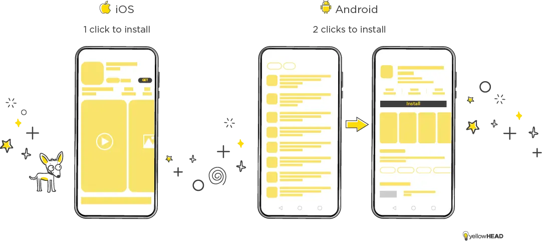
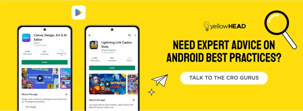
- Google Play: When users search a generic keyword, they mainly see your app icon and title in the results. That means your icon carries the heaviest conversion weight. Only after a tap do users see your Google Play screenshots and feature graphic.
- iOS App Store: Apple gives you more prime display space right away. Search results show the icon plus up to three screenshots (portrait) or one screenshot (landscape). Often, the install happens here, before users even tap through. This makes your iOS app store screenshots and icon a single conversion hook.
👉 Pro tip: For branded searches, both stores highlight the first result with extra visuals. Ranking #3 for a competitor’s keyword? Don’t celebrate too quickly — the extra visual space given to the top result pushes you further down than it looks.

App Store Icons: Small but Powerful
Your app icon is the most visible app store asset and often the first impression your user gets. A strong icon can make your app instantly recognizable.
- iOS App Store icon requirements: Apple requires a 1024×1024 px source file. The system scales it down for all sizes. Icons can be JPG or PNG (but no transparency). Always check Apple’s app store image requirements to make sure your assets display correctly across devices.
- Google Play icon requirements: Android icons must be 512×512 px and appear across listings, search results, and charts. Google has clear rules for icons:
- No shadows or rounded corners — Google Play applies these automatically, so don’t add them to your artwork.
- No banners or promotional text (e.g., “Best App!” or rating stars) — misleading elements can get your submission rejected.
- Keep it clean and simple so the icon scales well and matches Google’s overall design system.
👉 In other words: upload a clean square without extra styling. Google Play will handle the corner radius and shadow effects for you.
⚡ Remember: On iOS, updating an icon requires a new app version. On Google Play, you can update icons anytime in the Developer Console. Plan your ASO creative testing accordingly.
App Store Screenshots: Your Conversion Hook
First, it’s essential to keep the screenshots for ASO focused, with one clear message per image. When a composition is too crowded or tries to convey too much, users can lose focus, feel confused, and may skip engaging with the screenshot. Additionally, aim to make the main UI element stand out so that users can easily spot the key feature when scanning the image.
Screenshots aren’t decoration — they’re the visuals that hook users and tell your app’s story. Rule #1: one clear message per screenshot. Don’t overload with too much text or cluttered UI.
- iOS screenshots: You can upload up to 10. The iOS app store screenshot guidelines recommend accuracy, though reviewers vary in strictness. Main device sizes are 6.5” and 5.5”, but 6.9” has become increasingly popular and is worth including when possible.
- Google Play screenshots: Upload 2–8 images, but we always recommend using 6–8 screenshots to maximize your impact. Play Store screenshot sizes must be between 320 px and 3,840 px, with 16:9 or 9:16 ratios. Include tablet screenshots, since Google rewards apps that support larger screens.
📌 Follow these ASO screenshot best practices:
- Lead with your strongest feature in the first 3 images.
- Highlight UI but add branding to stand out.
- Use bold, simple captions for extra clarity.
Feature Graphic in Google Play
The feature graphic in Google Play is like your storefront banner. If you include a video, it becomes the clickable thumbnail that dominates the page. Even without a video, uploading it is required.
Feature graphic size: 1024×500 px. Keep the main focus in the center, but don’t let the play button cover key elements. Avoid placing important details near the 70 px edges that get cropped.
A well-designed feature graphic can significantly boost installs by making your page more visually engaging.
App Store Poster Frame
On iOS, the poster frame is the still image shown before your app preview video auto-plays. By default, it’s the frame at second 5, but you can set it manually in App Store Connect.
Think of it as your app store preview image — it needs to work as a standalone hook, just like your first screenshot.

ASO Video
Video is your chance to showcase the app in motion. Whether it’s gameplay or a product walkthrough, a short ASO video can make installs feel like the obvious choice.
- Google Play video: Hosted on YouTube, landscape only. The first 30 seconds matter most, since that’s what can auto-play.
- App Store video: Called “app previews.” They auto-play muted, and must follow Apple’s app store video best practices — only in-app footage, no hands, no over-the-shoulder shots. Keep it 15–30 seconds.
Both platforms demand videos that grab attention immediately. Think: start strong, keep it short, and use your video as the ultimate hook.
In-App Events (iOS)
Since iOS 15, In-App Events (IAEs) have been a powerful way to highlight timely content: competitions, premieres, or special experiences.
Each IAE requires:
- An event card (image or video)
- An event detail page
Best practice: Keep your IAE design clean and focused. Show the main feature or theme without clutter. Avoid heavy text inside the images — the short description and event title already give context, so let the visuals grab attention.
Video can make your event card more dynamic, but static images are easier to produce at scale. Plan based on your creative resource
Custom Product Pages (CPPs)
Custom Product Pages let you create multiple storefronts for different audiences. Each CPP can feature unique app store screenshots, preview videos, and promotional text.
Use them to:
- Showcase specific features (e.g., a sport, character, or tool).
- Run seasonal or regional campaigns.
- Match ad traffic with tailored creatives for higher conversion.
Follow the same app store image sizes and screenshot guidelines as your default product page. Think of CPPs as targeted storefronts, each built to serve a niche audience.
Key Takeaways
- Treat your ASO images and app creatives as conversion drivers, not afterthoughts.
- Icons and first screenshots are your primary user hook — test them frequently.
- Follow app store image guidelines and size specs to avoid rejections.
- Use feature graphics and ASO videos to bring your app to life.
- Take advantage of newer formats like IAEs and CPPs for extra visibility.
With the right ASO creative strategy, your storefront won’t just look good — it’ll convert better.
Need help designing app store creatives that actually drive results? Our ASO team and creative studio at YellowHEAD are here to help. Contact us today!
This article was originally written by Chen Ofir.